 Cydonia Cydonia
How come some of the images released look like sand pictures?
The 'official' image doing the rounds of TV news programs is currently this:
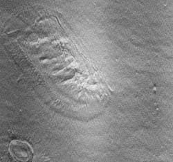
...(as of 6th April, CNN and BBC). Now this to me looks nothing like the level of 'height' detail that's available from another officially released NASA image:
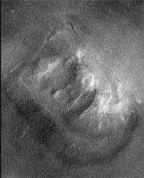
...but it's fairly easy to produce an image like the current 'News' version, simply by inverting the better positive image above to produce a pair like this:

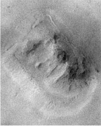
...and then adding them as 2 separate channels in PhotoShop, and selecting 'Overlay' as the method by which to calculate the result:
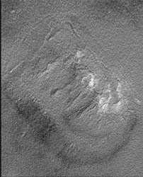
This is a perfectly valid image analysis technique - it just depends what you're looking for. The result, however, subdues the impression of height in favour of bringing out certain fine details.
Here's the official 'News' image alongside my constructed 'average' of the contrast stretched pos. and neg. images...


... a world away from what can be seen from either the original pos. image, or its negative version:

One final question - how could the 'sand picture' version, if a true representation of the surface topology, produce the length of shadow on the original Viking images? It just isn't high enough for the Sun angle to work.
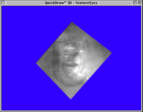
This is what you get if you rotate the good positive image in 3D:
Back to main Cydonia page.


|

